

Many years ago I was sitting with a client who had a $500,000 portfolio and was about to retire. He asked me how much I thought he could take in retirement income from his equity mutual funds that would allow his portfolio to last him and his wife their entire lives. When I told him that the old rule of thumb (four percent) would indicate no more than $20,000 each year—adjusted for inflation—he almost kicked me out of his house.
Consumers are perplexed many times when you tell them that the withdrawal “rules of thumb” from a 50/50 portfolio or a 60/40 portfolio range between 2.5 percent (new rule) to four percent (1990s rule). As this client said, “Doesn’t the stock market average almost double digits? And you are telling me to take only four percent?” Well, even if the market does average double digits, the market does not go up in a perfect linear fashion. If it did, then “double digits” per year would be a safe withdrawal rate from a 100 percent stock portfolio, not accounting for inflation adjustments anyway.
If you read my article last month on sequence of returns and sequence of inflation risk, that was a preface to this article. It is because of sequence of returns that there is a disconnect between what the stock market has averaged over time and what the “rules of thumb“ on withdrawal percentages are.
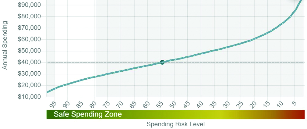
Take for instance the graph that I generated with the “JOURNEYGUIDE” retirement income software. Great software! This graph is a part of “Monte Carlo Analysis“ on a 100 percent stock portfolio. Basically, what I asked my software to do was to show me if my 65-year-old client—who is retiring in a year with a $1 million Roth IRA—can take $40,000 out in the first year (increasing by a three percent inflation rate). The assumption here is that he will live until age 92 as he is extremely healthy. Again, we start with an assumption that his money is in 100 percent U.S. Large Cap stocks.
The “Income Frontier” shows us the probability of him being able to sustain various levels of income in retirement without running out of money. The parallel line is our goal of $40,000 of annual inflation adjusted income. Where our blue curve intercepts indicates that there is only a 54 percent chance that his portfolio would last his lifetime by taking out $40,000 inflation adjusted. Not very good! How is it only a 54 percent confidence level if the growth assumption on this stock portfolio is over seven percent? Because of sequence of returns risk. (Note: What a 54 percent confidence level means is, he runs out of money prior to death in a whopping 46 percent of 5,000 market simulations that take place in this software!)
I like to target the white area—confidence levels of 80 to 95 percent. At the 95 percent confidence level, my client is only projected to take $18,000 per year. However, the tradeoff is the right side of the chart. If one wanted to roll the dice, he could hope and pray that he is in the top five percent of scenarios throughout his retirement years and take inflation adjusted withdrawals of around $80,000 per year. Good luck with that!
If I were to paraphrase Chart 1 I would say, “I am 99 percent confident that you will be able to take retirement income of $15,000 or more per year (left side) and I am almost zero percent confident you can take out more than $90,000 per year (right side).
The GLWB
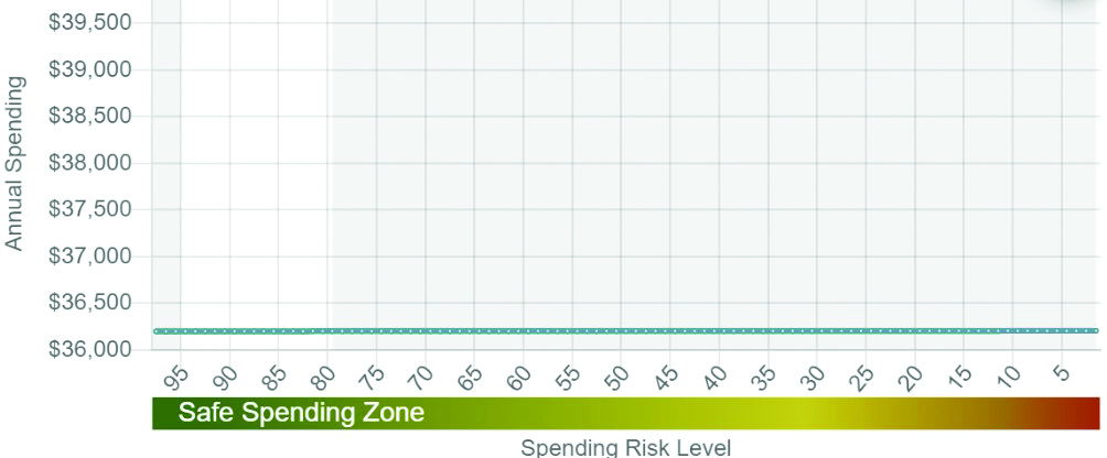
Chart 2 is the same analysis using a GLWB that will guarantee our client (64-year-old male) a flat $57,500 per year forever—once he activates the rider at age 65. First let’s talk about the positive traits. The positive is the flat line. We know with certainty exactly how much income he can take from the annuity forever. There is no “sequence of returns risk.” However, the elephant in the room is that our new blue line is only at $36,200! Why not $57,500? Because of inflation adjustments of three percent that we are incorporating. Remember, the goal is to have an inflation adjusted amount of income each year which, again, is what the withdrawal rules of thumb take into account. So basically, in our first year of retirement, if we were to take out our $57,500 and only spend an inflation adjusted amount every year, what would that amount be so that by the time our client dies at age 92 we have been able to provide this inflation adjusted payment every year? It cannot be $57,500 in the first year because we must inflate it later on, which this GLWB rider does not do. Based on the math and assuming a three percent constant inflation rate, the GLWB would only give us around $36,200 inflation adjusted income per year. (Note: For simplification, we assumed the excess “reinvestment” is going to cash for income in later years.)
So the positive with our 100 percent stock portfolio is the part of the chart on the right hand side. The upside potential. The negative is the left hand side of the chart. With the stock portfolio, we cannot be anywhere near 100 percent confident that we will be able to get an inflation adjusted income of $40,000 per year.
Conversely, with our GLWB graph, the positive is the predictable flat line and the fact that the flat line is not far off from our goal of $40,000. However, the downside is that the opportunity for more inflation adjusted income is slim. At the 95th percentile we are looking at $36,200 in income. At the overly-optimistic five percent confidence level we are looking at $36,200 in income.
(Note: Technically there is an additional level of variation that one could incorporate in these charts, and that is inflation assumptions. For instance, if we were to experience deflation over the next 30 years, our lines would move up, all else being equal. Or, inflation could continue to be high which would lower these lines.)
50/50 Mixture (Green Line)
With Chart 3 the software took our first “blue” scenario—the stock portfolio—and overlaid a scenario that some might find more “optimal” for those consumers approaching or already in retirement. These consumers obviously do not want the uncertainty of the steep 100 percent stock curve but, at the same time, they may want the potential for more income rather than the flat GLWB curve. Thus, the green curve is a 50/50 mixture of the stock portfolio and our annuity. As you can see, what we have done is this: At the very high confidence levels we have significantly brought up our inflation adjusted distribution amounts. At the same time, should the stock market skyrocket for the next 30 years, the right side of our green line is well above what it would have been if we otherwise just had all $1 million of our dollars in the GLWB.
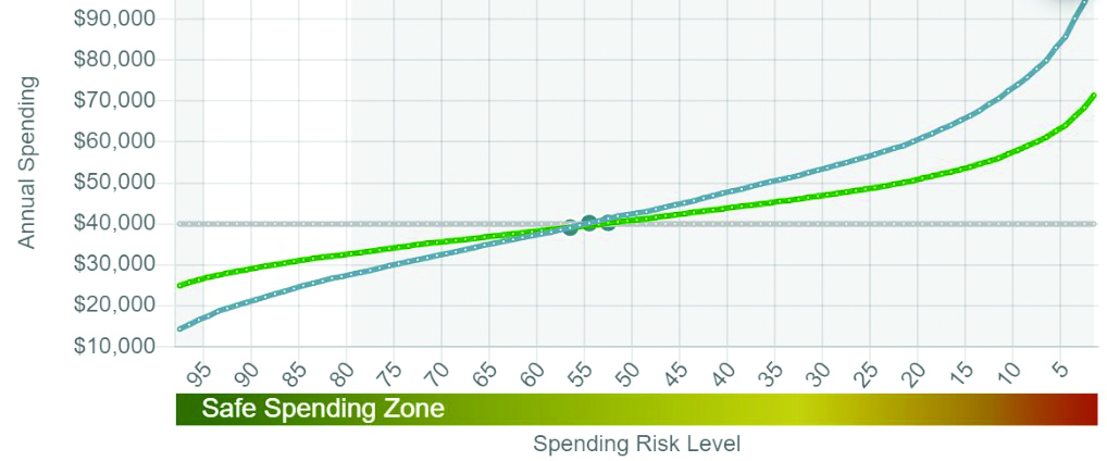
With this strategy we are combining the upside potential of the market with the reliable and guaranteed GLWB income. Naturally, the “50/50 portfolio” is not a new concept. What is a new-ish concept however is to replace the bond portion with indexed annuities/GLWBs.
In the future I will also model out using accumulation focused indexed annuities to create somewhat of a synthetic GLWB strategy. However, that becomes a little more challenging because past performance that we see in indexed annuity illustrations tends to look overly rosy which can lead to flawed analysis
Final Thoughts
You certainly noticed that I anchored our expectations on four percent, or $40,000. This is because I wanted to demonstrate to you how difficult it is to reach this level of income—at least on a conservative basis. Hence the reason that the four percent rule has gone the way of the dinosaur.
In recent years a few studies have stated that there is around a 50 percent chance of failure for a 50/50 portfolio while using the four percent rule of thumb. By the way, check out our first graph. Although that portfolio is all stocks, it is consistent with that analysis as it shows the portfolio failing 46 percent of the time. Which brings me to my final point:
The 50/50 portfolio above is actually quite attractive. Many of us know that the new rule of thumb is around 2.5 percent on 60/40 portfolios. I emphasize 60/40 because old rules used the 50/50 portfolio. However, as interest rates have dropped, the retirement income experts increased the stock exposure to 60 percent and decreased the bond exposure to 40 percent in their analysis. This increased stock exposure tends to show higher percentages of income but yet much lower than the four percent rule that was created in 1994. In the end, the magical withdrawal rule of thumb for inflation adjusted income is around 2.5 percent. We have arrived at this with our portfolio above except the portfolio above may be superior to the 60/40 portfolio. That is, by replacing bonds with our annuity, we do not get decimated when interest rates increase.
Lastly, although I don’t condone putting all of the client’s money into an annuity, look at the second graph in this article. If you really wanted to smoke the 2.5 percent rule of thumb, there it is. The $36,200 inflation adjusted income is a whopping 44 percent higher than $25,000 (2.5 percent). I just hope today’s inflation rate of 7.5 percent is “transitory.”
JOURNEYGUIDE Income Software: www.journeyguideplanning.com.